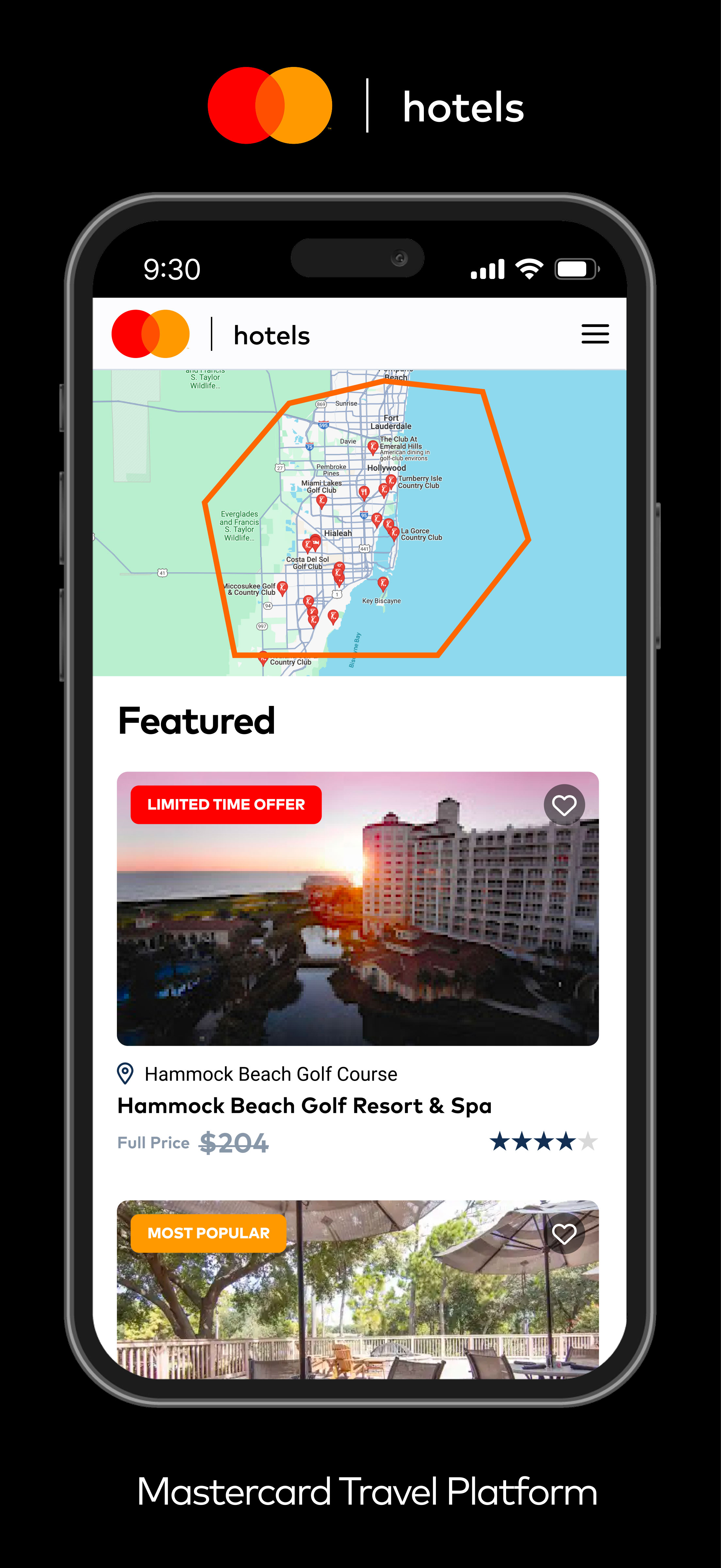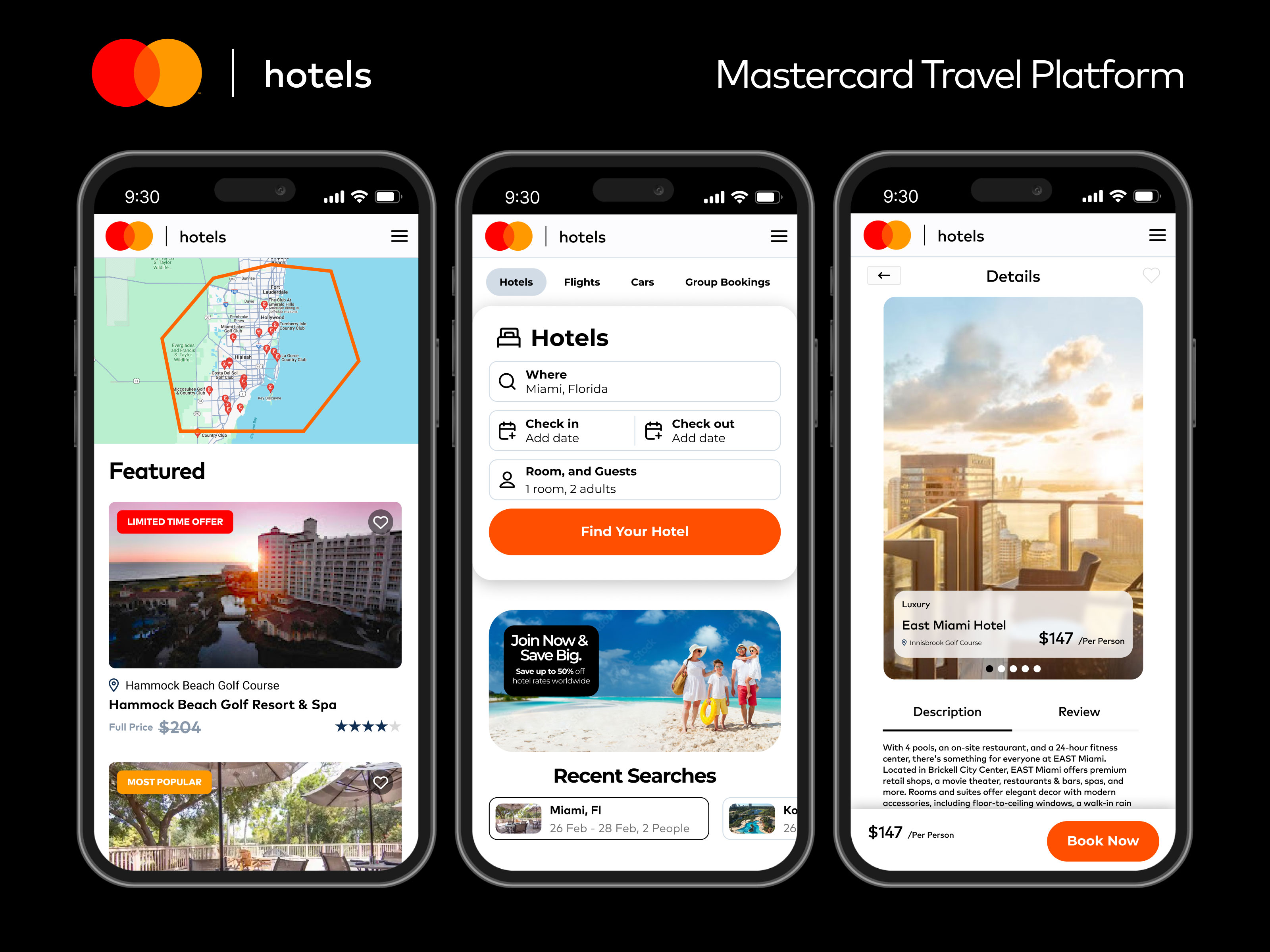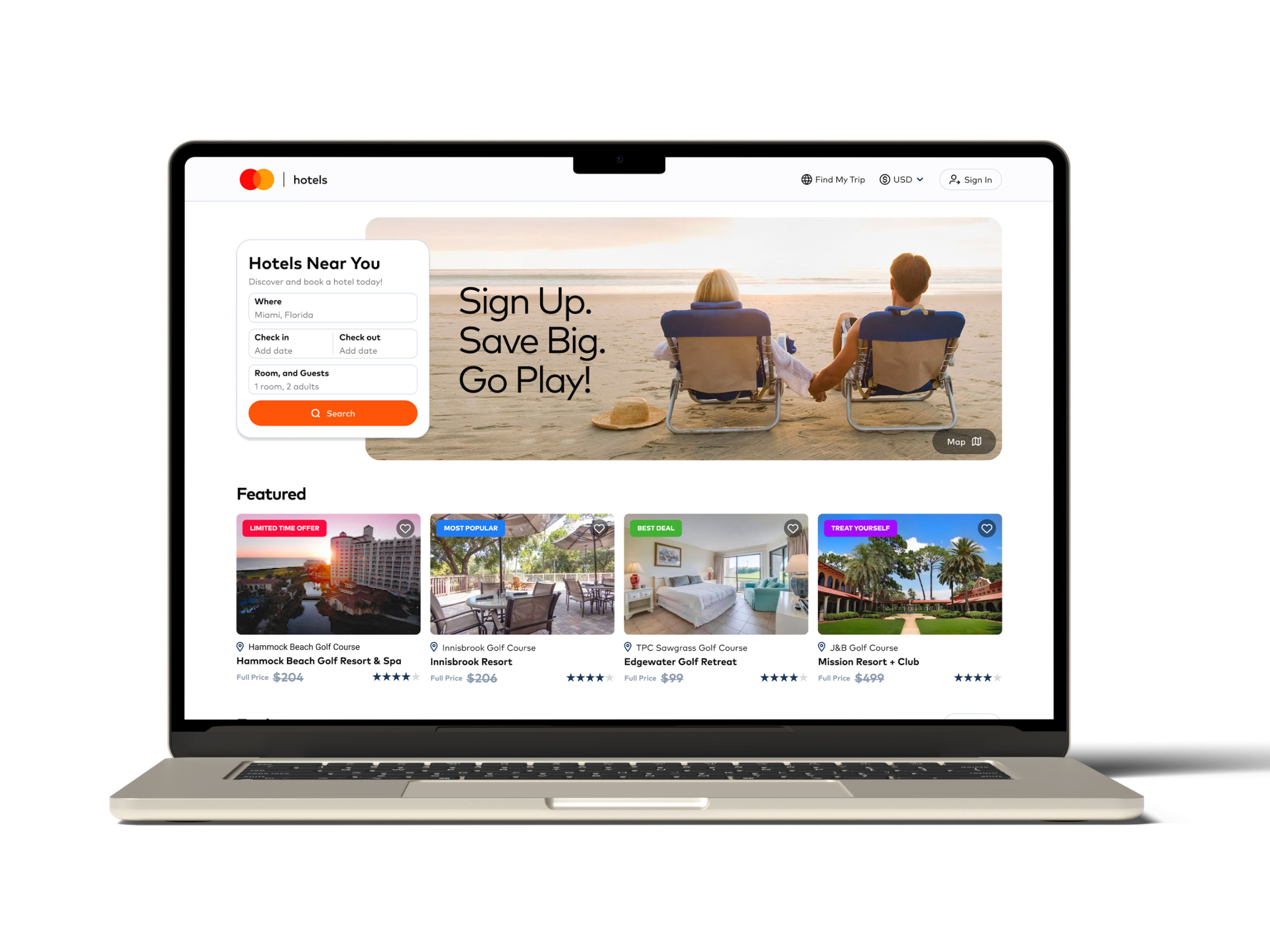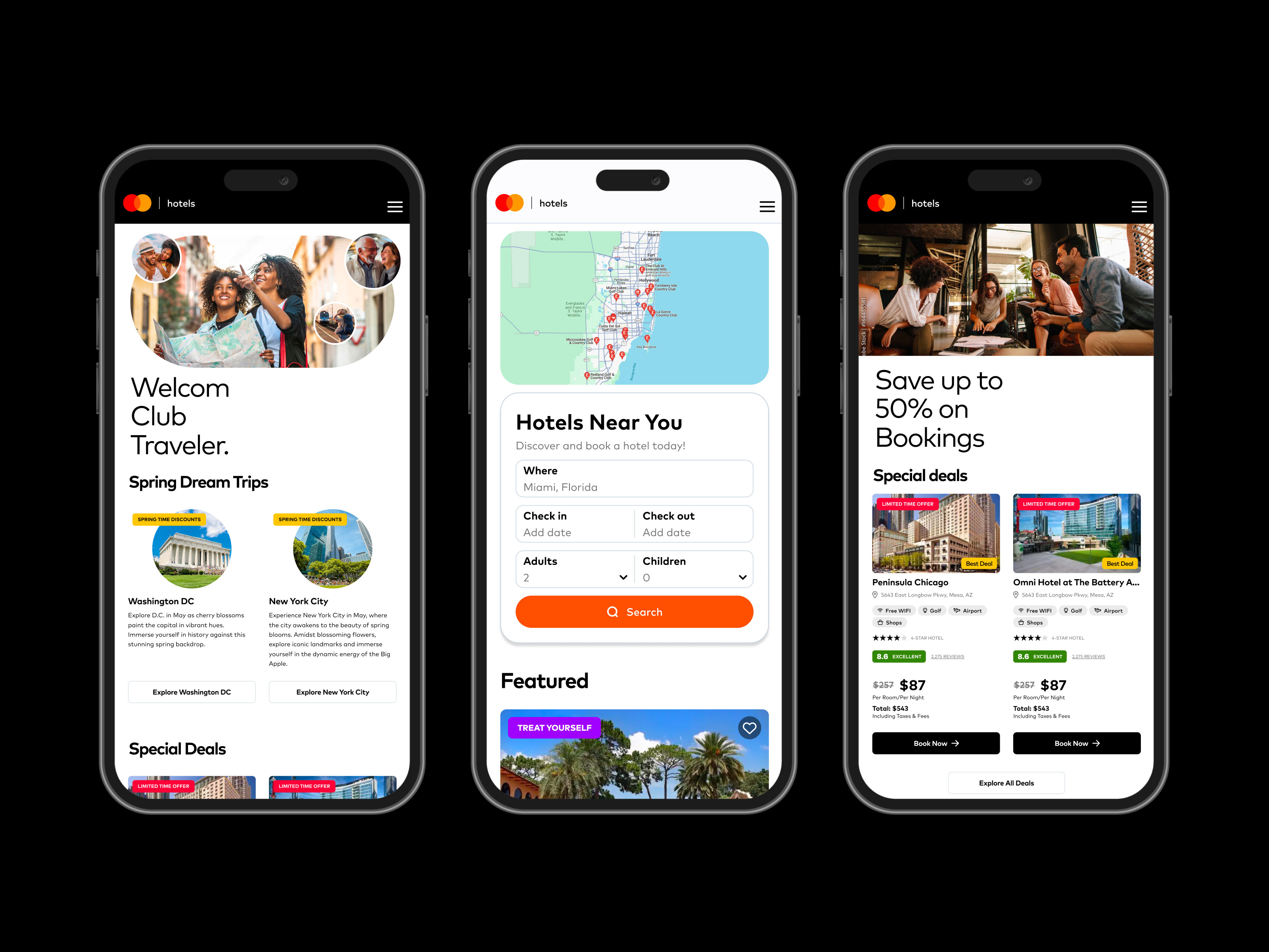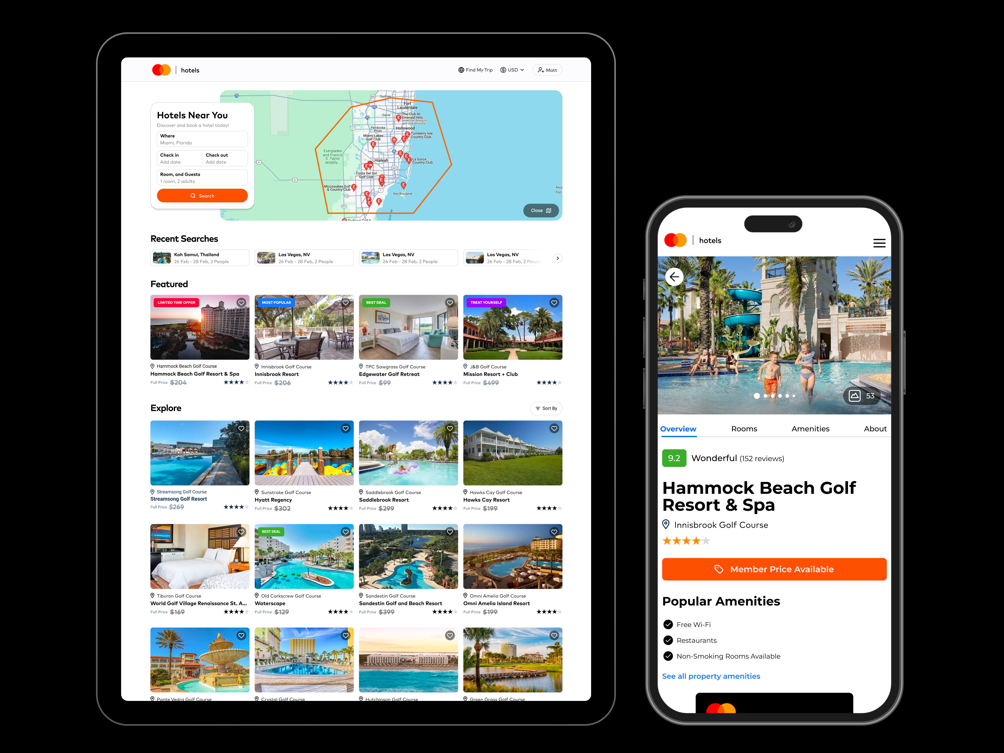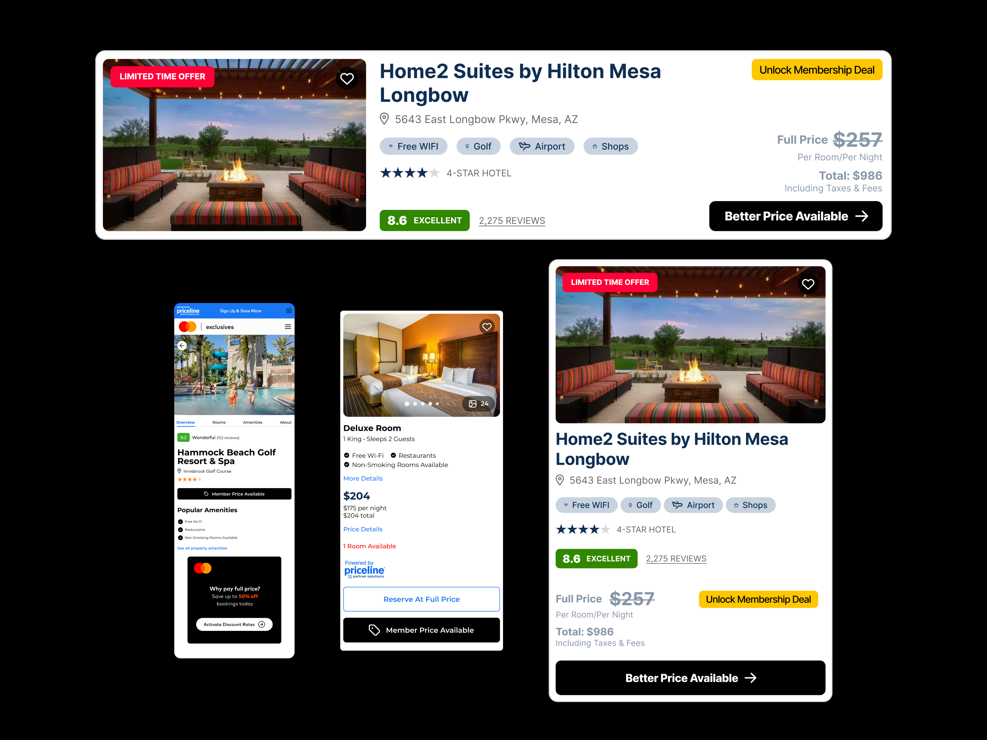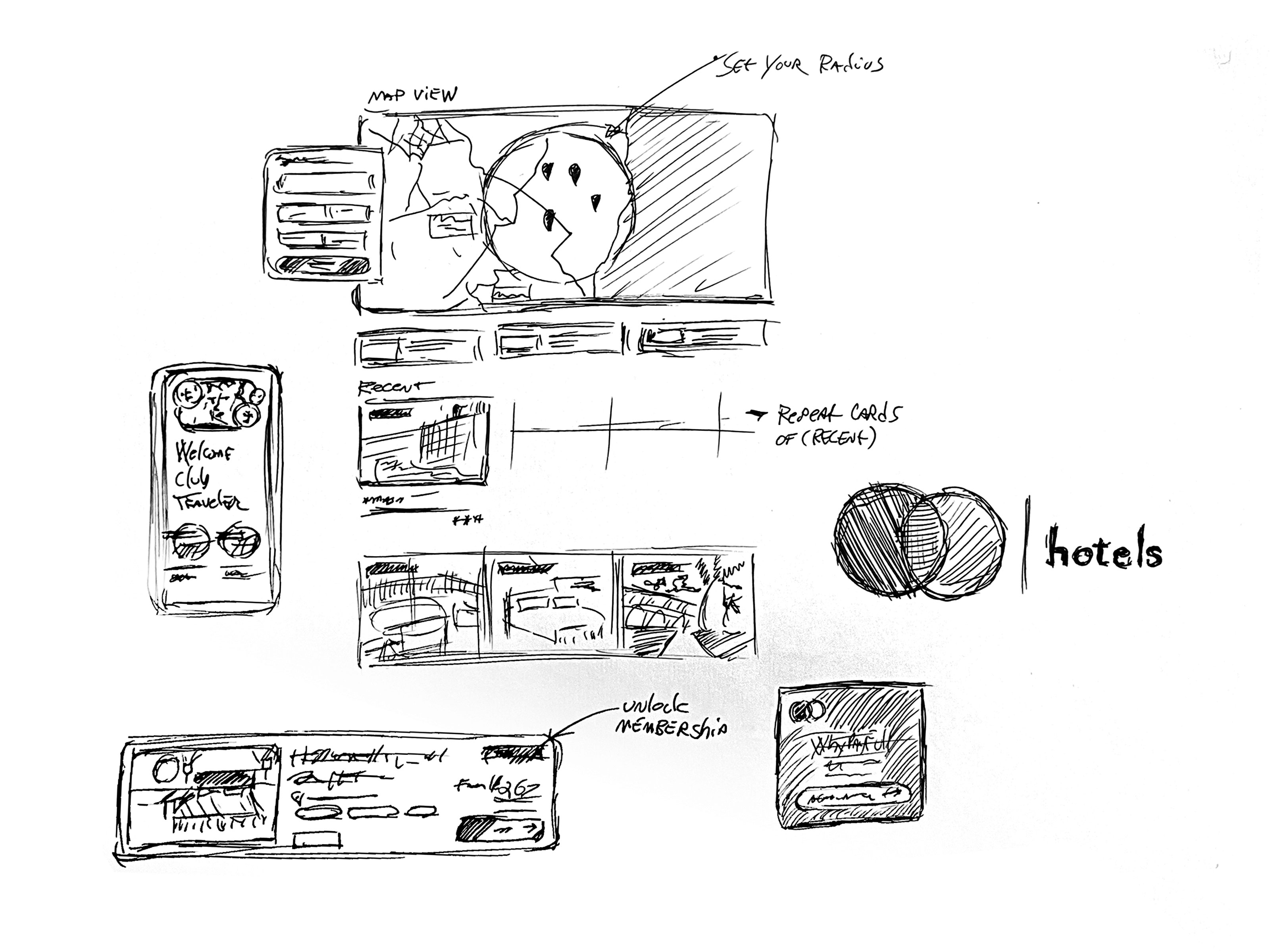
I treated it as a benefit, not a destination. The app did not try to stand on its own as a separate brand or experience. It felt like something you unlocked by being a Mastercard cardholder.
The design leaned on familiarity and confidence. Clear language, straightforward flows, and subtle cues reinforced that this was part of your membership, not another account to manage. The goal was that it felt obvious and expected, like something you already had access to, just hadn’t used yet.