This isn’t technically an interview, but it’s pretty close.
— Let’s talk about Myro
What was the real problem this project needed to solve?
Myro was not just launching another deodorant.

They were asking people to rethink how deodorant works. As a new brand in a crowded personal wellness space, they had to earn trust quickly while explaining an unfamiliar model built around reusable containers and refillable pods. Read aloud, it sounded more like a NASA experiment, which made the task immediately clear.

The real problem was education without friction. Explain too much and we risked scaring people off or boring them. Explain too little and the product felt confusing or risky, especially with a subscription model attached.

The work focused on simplifying the story, visualizing the model, and making the sustainable choice feel financially obvious with minimal effort. And of course, it had to be fun. #armpitsjustwannahavefun
How did you decide what to focus on, and what to ignore?
I was very clear about who I was designing for. The core audience was younger, style forward, and environmentally conscious, primarily people in the 18 to 35 age range. Because of that, I was not trying to optimize the experience for older or more traditional deodorant buyers who would be harder to convert to this type of product, especially in the early stages. I knew we could bring them in later.

I focused on showing how easy the system was to use, how the refill pods worked, and why the model actually saved money for a younger audience. With Myro, the real cost is the reusable container upfront, not the waste.

The goal was to make the sustainable choice feel simple, stylish, and smart for the people most likely to adopt it first.
How did this project impact the business?
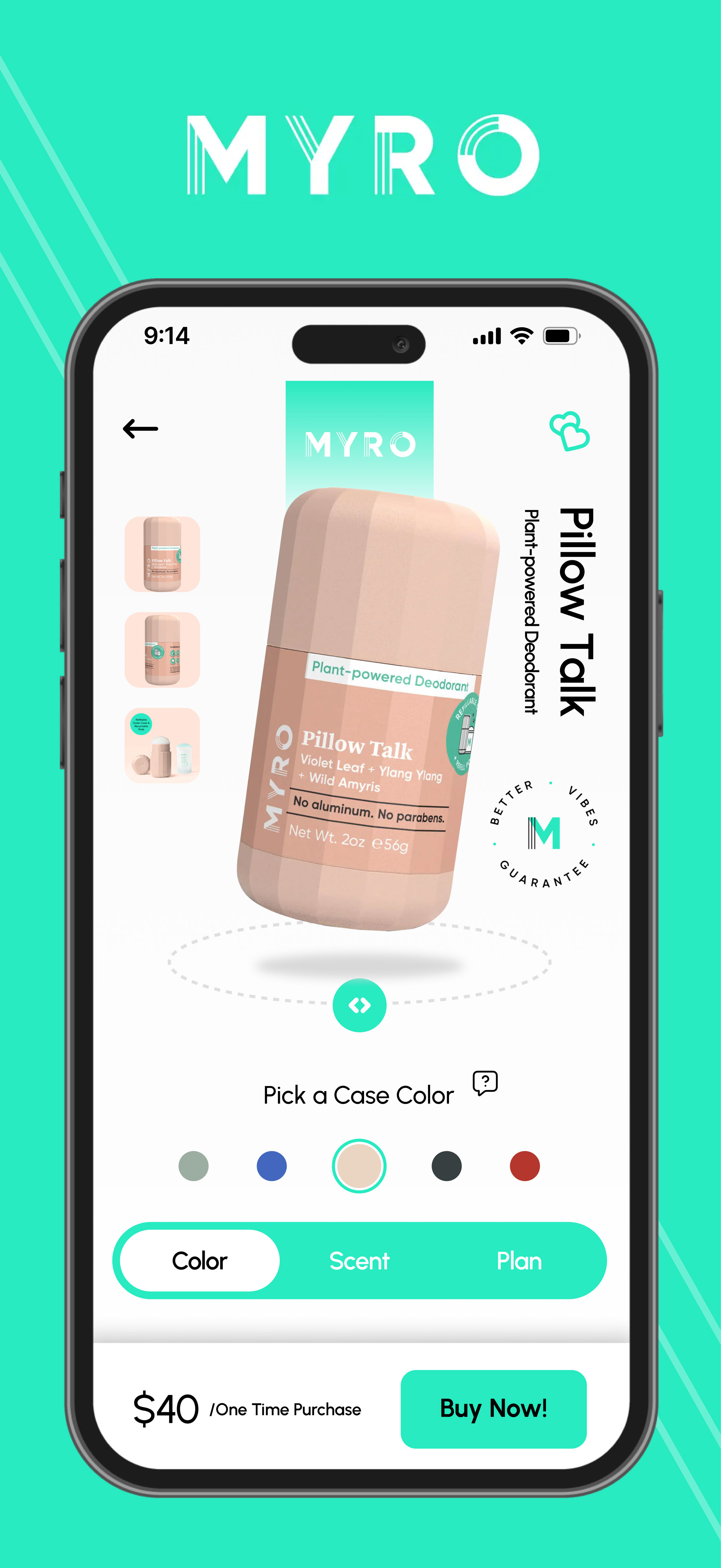
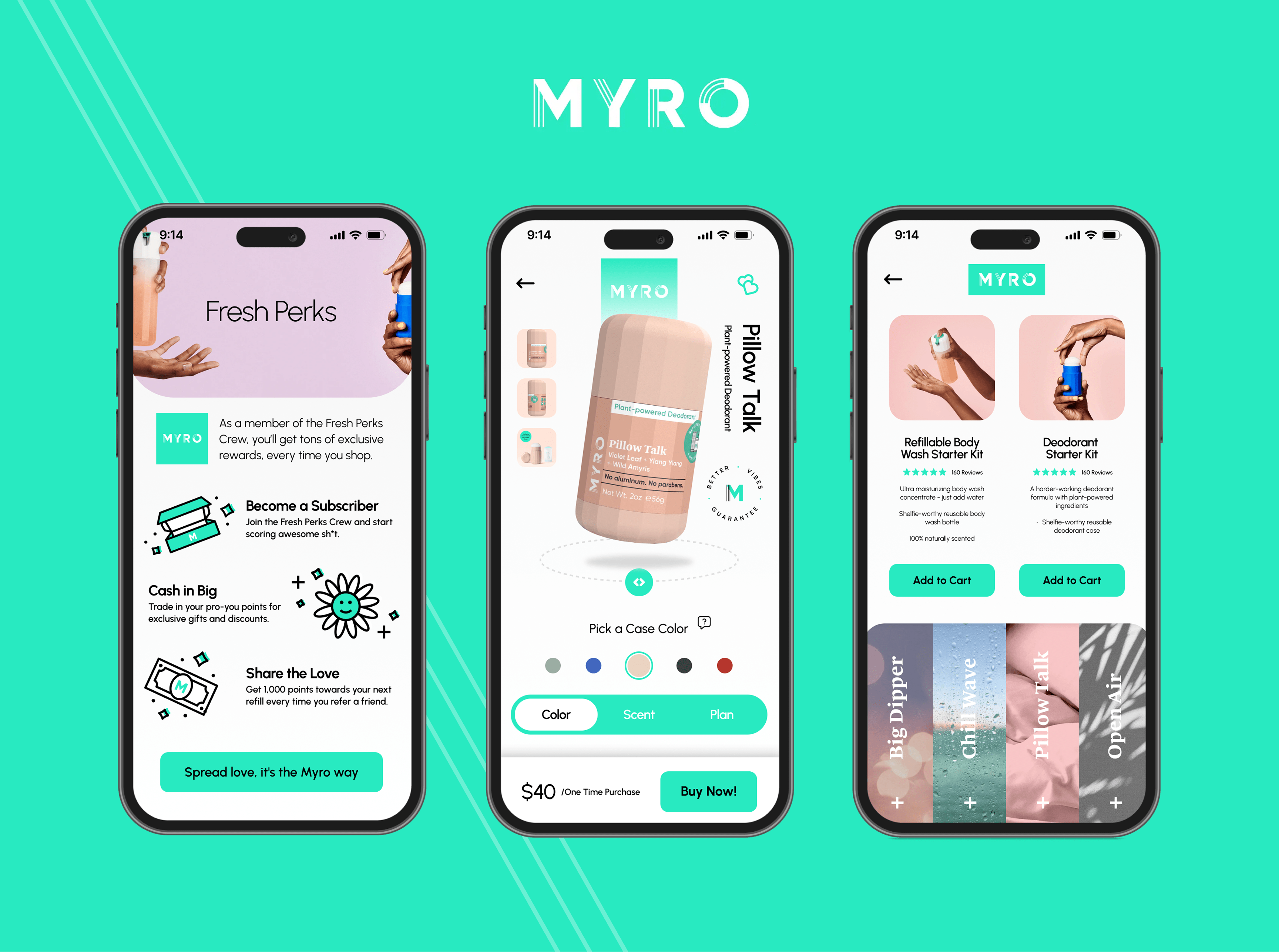
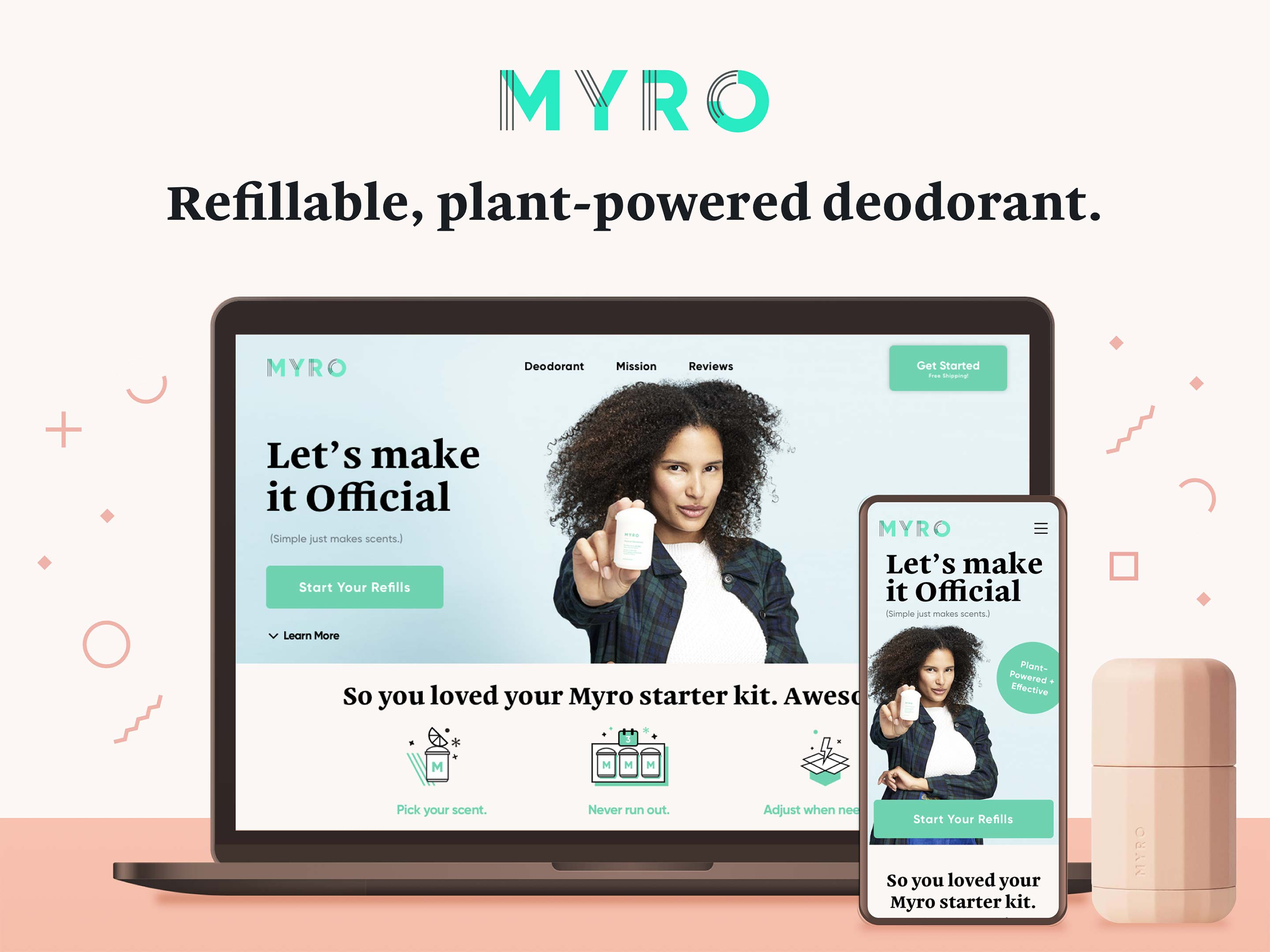
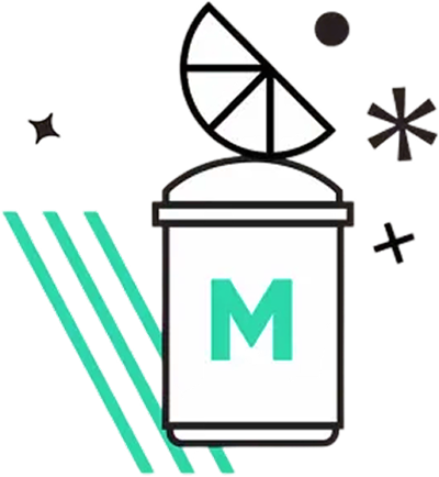
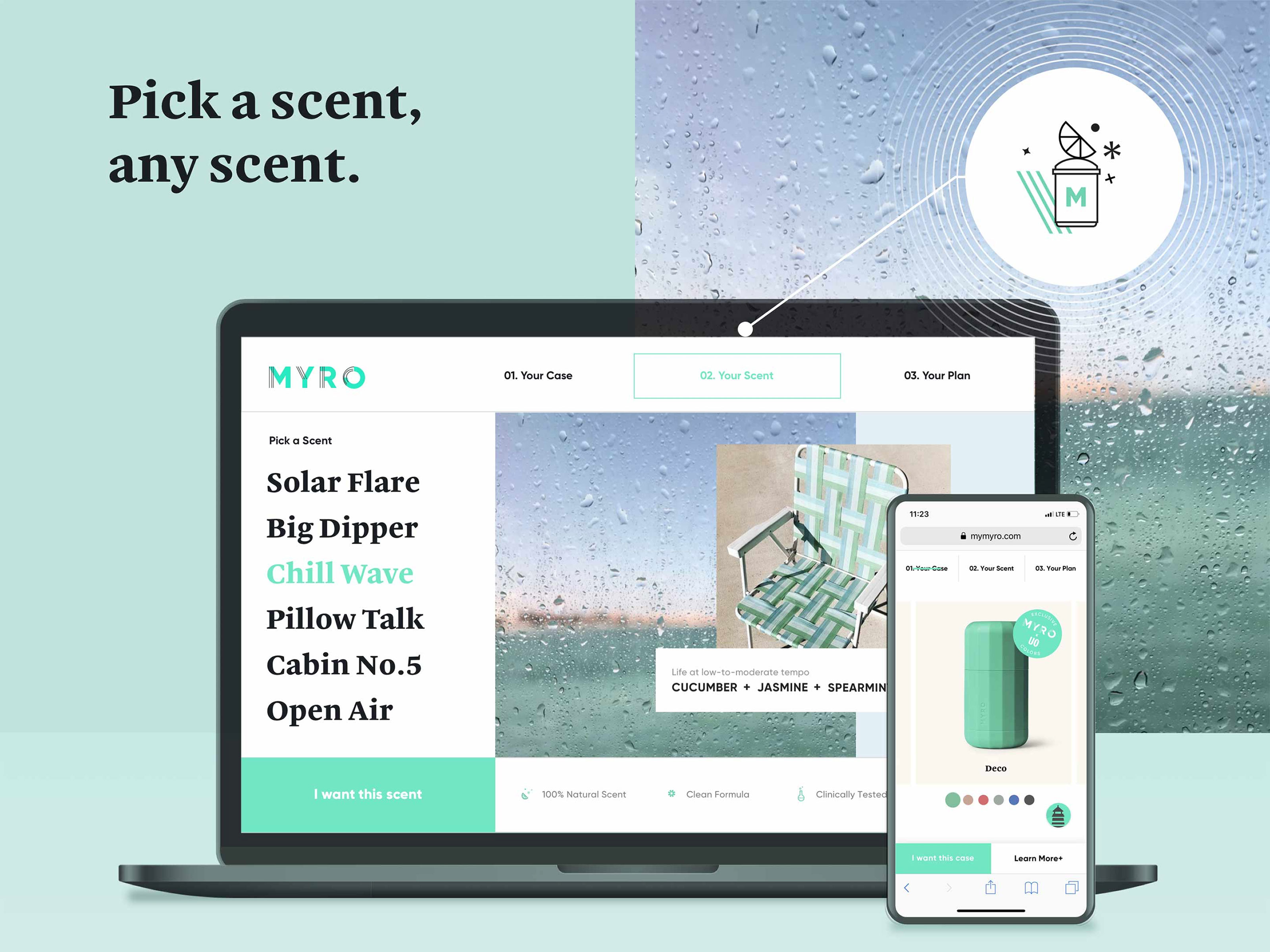
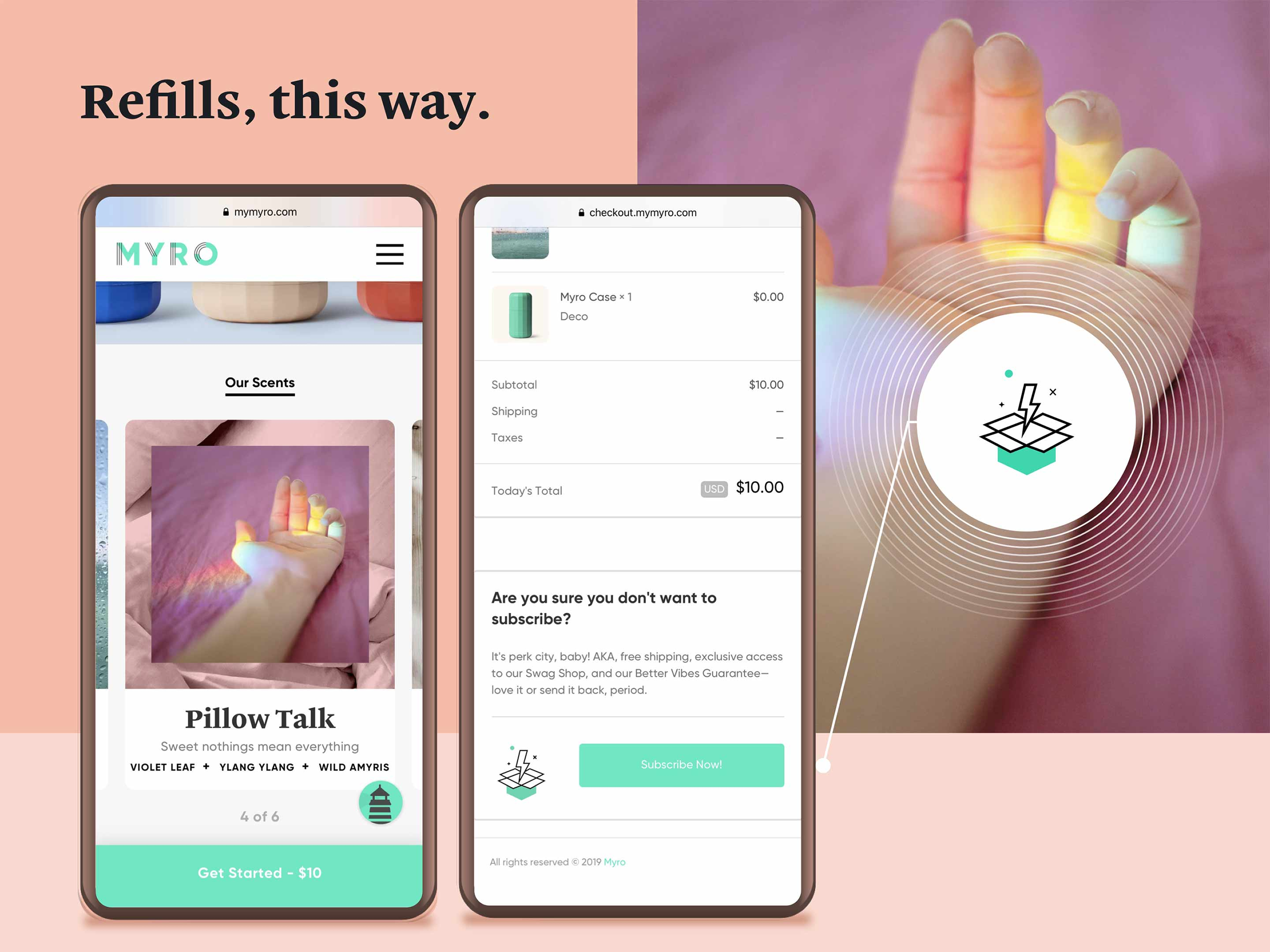
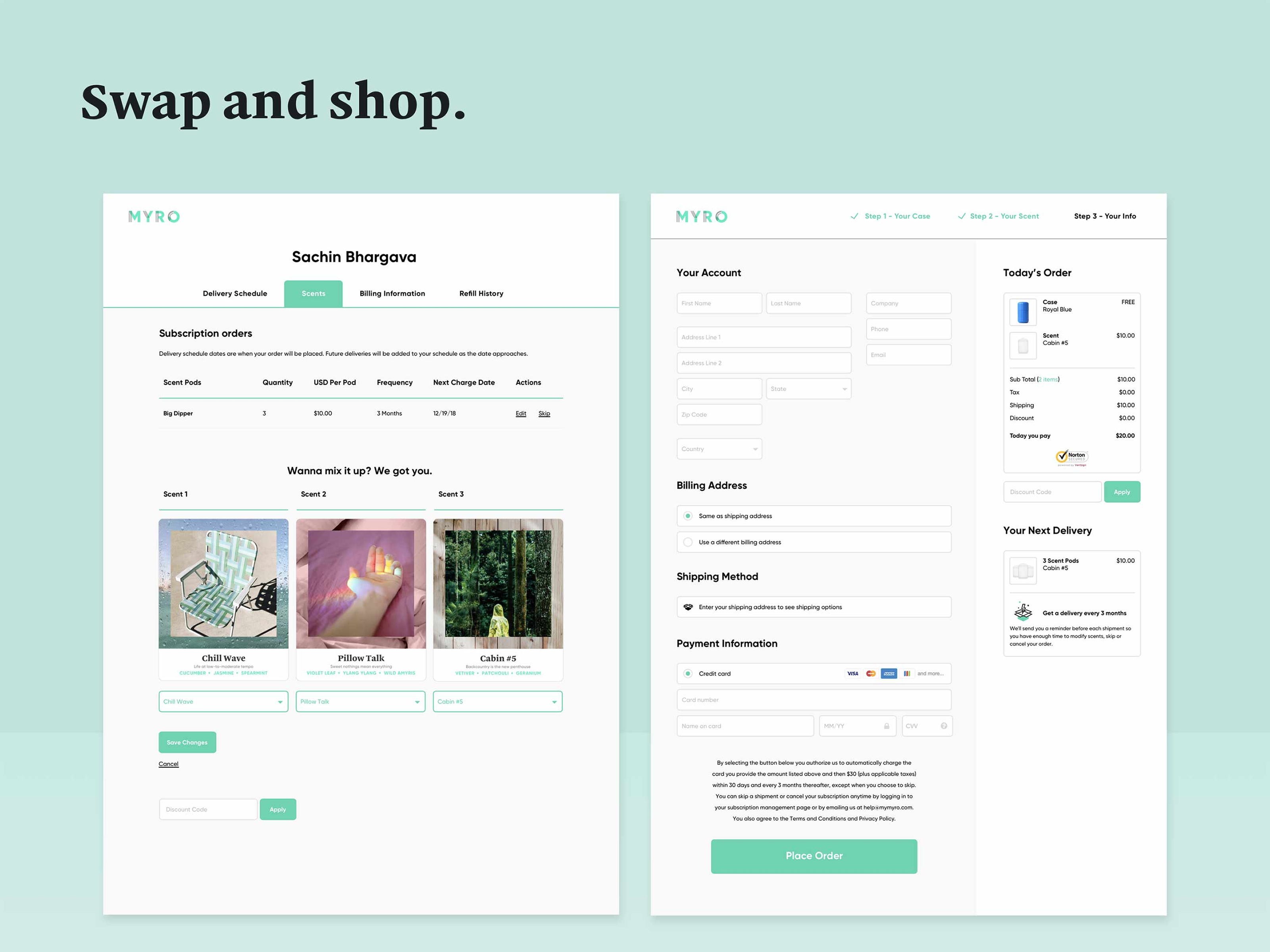
This project supported Myro at a critical launch stage, where clarity and trust directly affected conversion. My involvement spanned brand expression, image direction, visual language, and a clean, highly focused UX/UI that made an unfamiliar refill model easy to understand.

Before launch, Myro built a waitlist of roughly 16,000 people and raised about $2 million in early funding, signaling strong customer and investor interest.

Source: Beauty Independent

Following launch, the brand reported scaling to over $8 million in revenue and later expanded into major retail through Target, significantly increasing reach and credibility.

Source:  PR Newswire
What trade-offs did you have to make?
The core trade-off was choosing restraint over flash. I kept packaging intentionally simple so costs stayed down and the product stayed true to its sustainability story. With little budget for custom photography and no polished 3D renders, I leaned into scrappy problem-solving. Stop-motion ftw!

Dom Pérignon ideas on a Miller High Life budget.
How did you work with stakeholders, engineers, or leadership?
It was a strong cultural fit.

Leadership was open to ideas and moved quickly, which let me present and test ideas as fast as I could develop them.

Engineering handoff was efficient and straightforward. Designs were clear, constraints were understood early, and we were able to move from concept to build without friction.
If you were doing this again, what would you do differently?