You thought this was a portfolio review. Plot twist. Interview.
— Let’s look at NowWith
How do you design tools that feel powerful without overwhelming non-technical users?
I assume people just want to get something done, not learn a tool. Power comes from smart defaults and clear next steps, not more options.

If someone can record, edit, and share without thinking about the software, the tool is doing its job.
What does “simple” actually mean to you when people are creating and editing video?
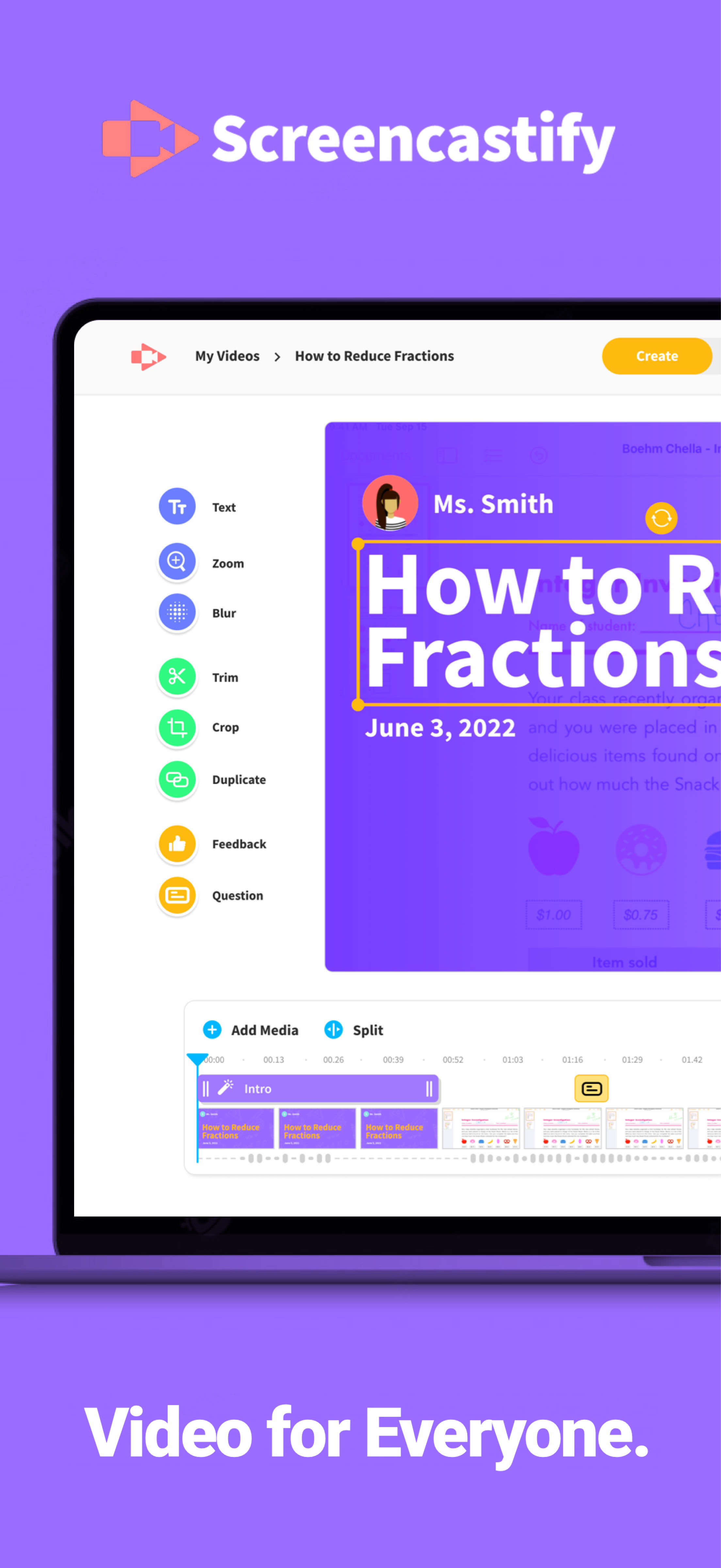
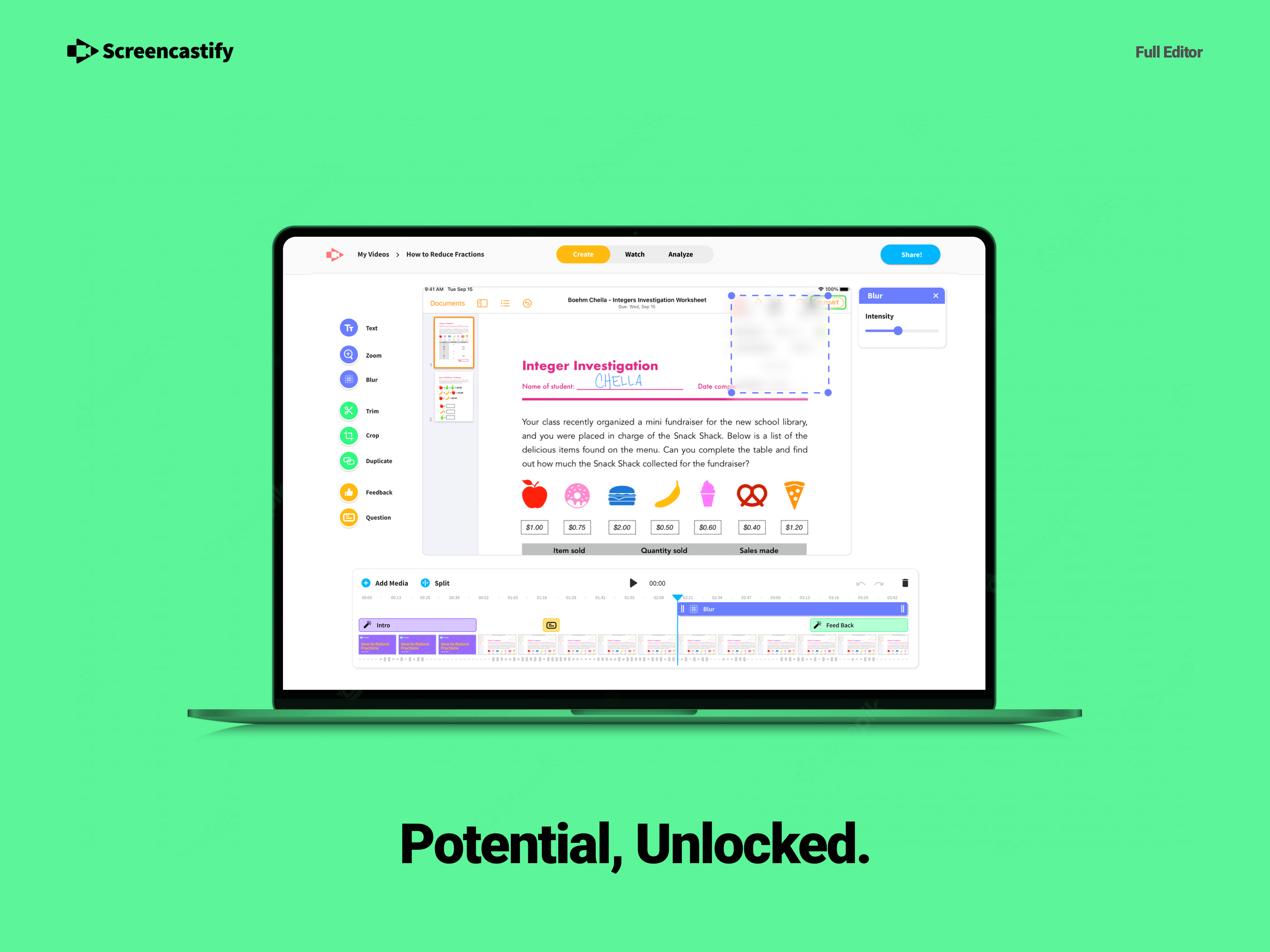
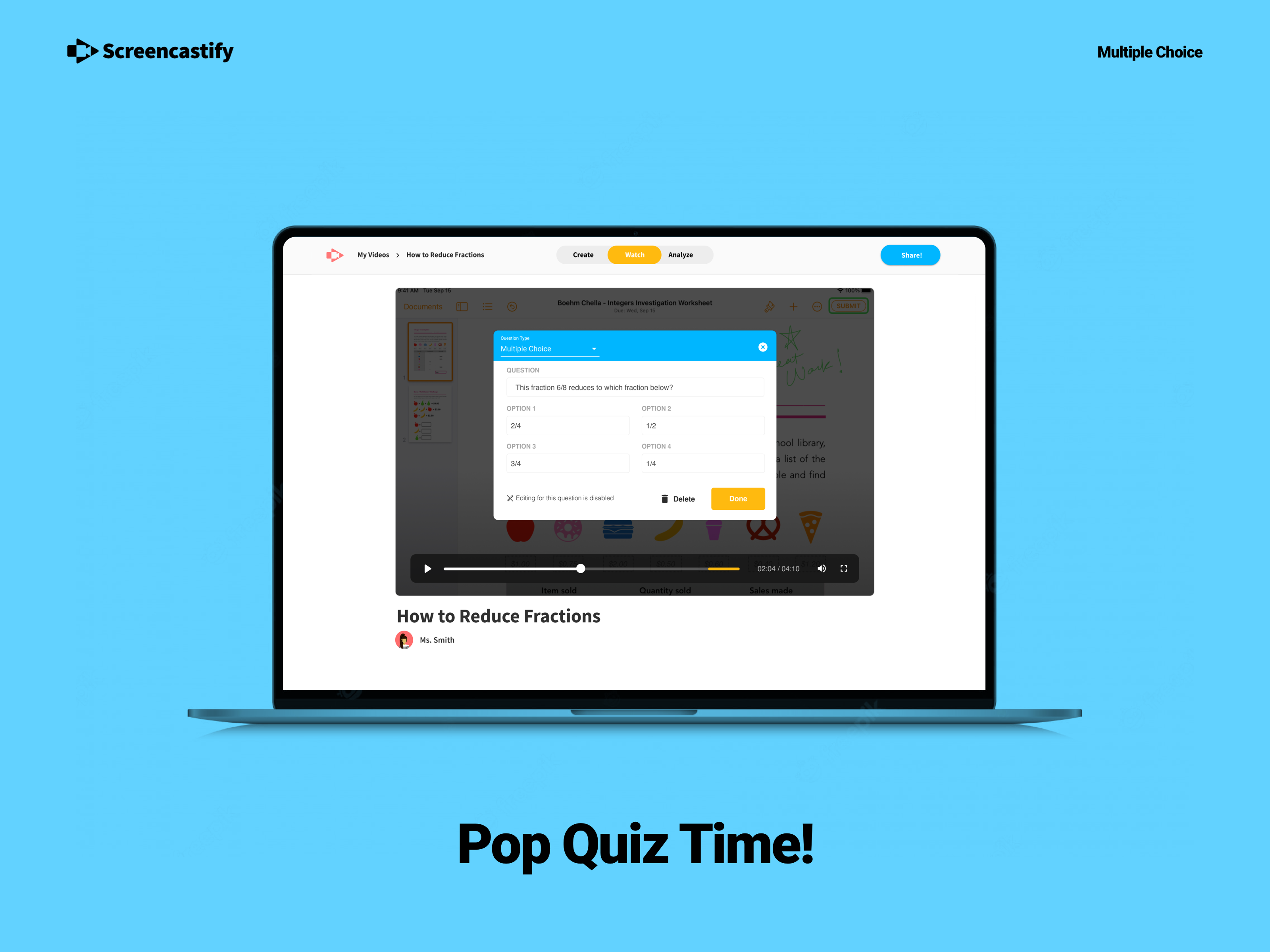
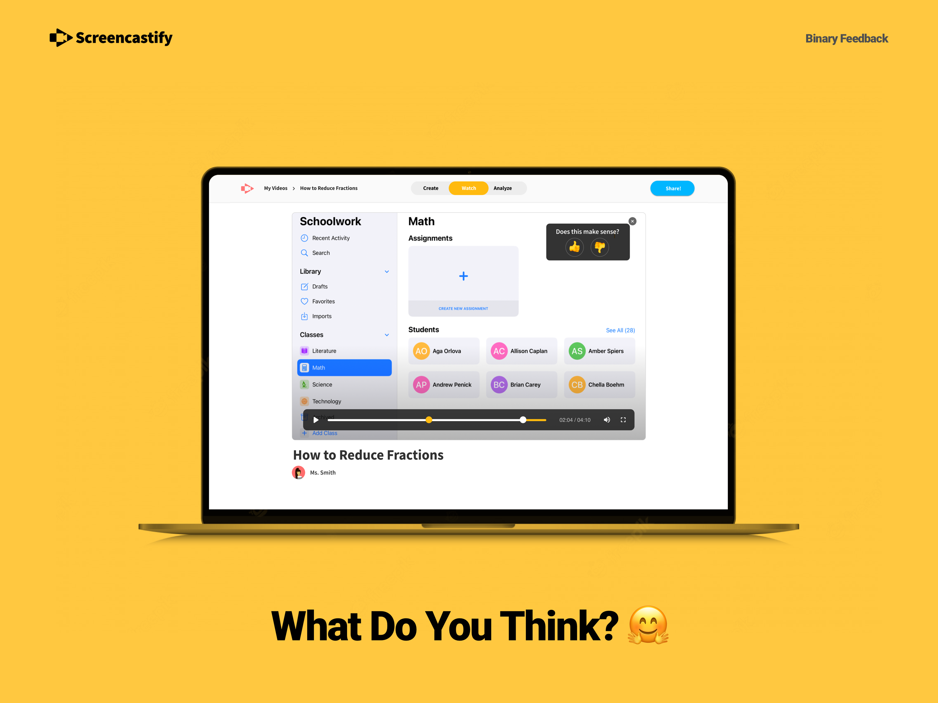
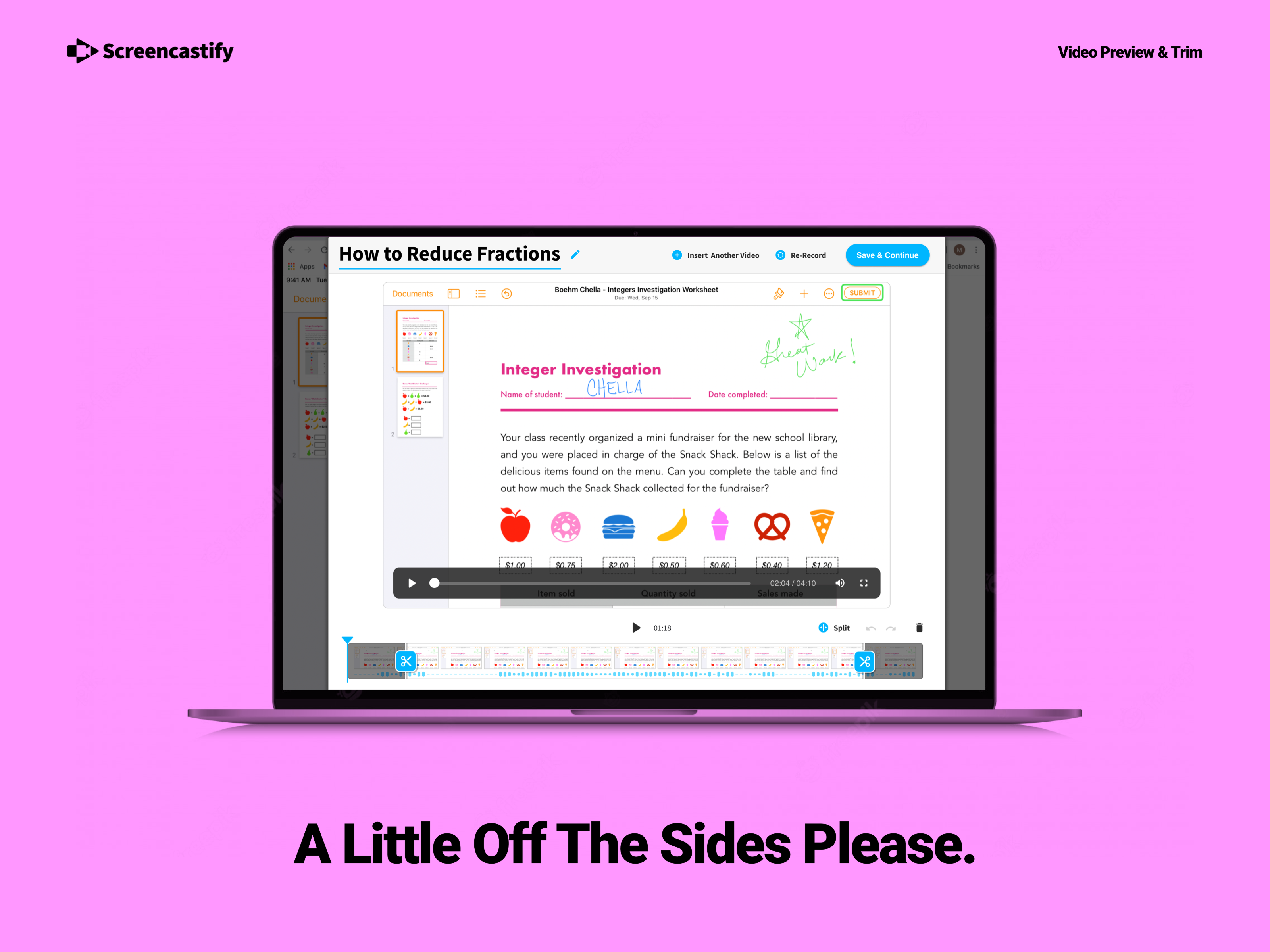
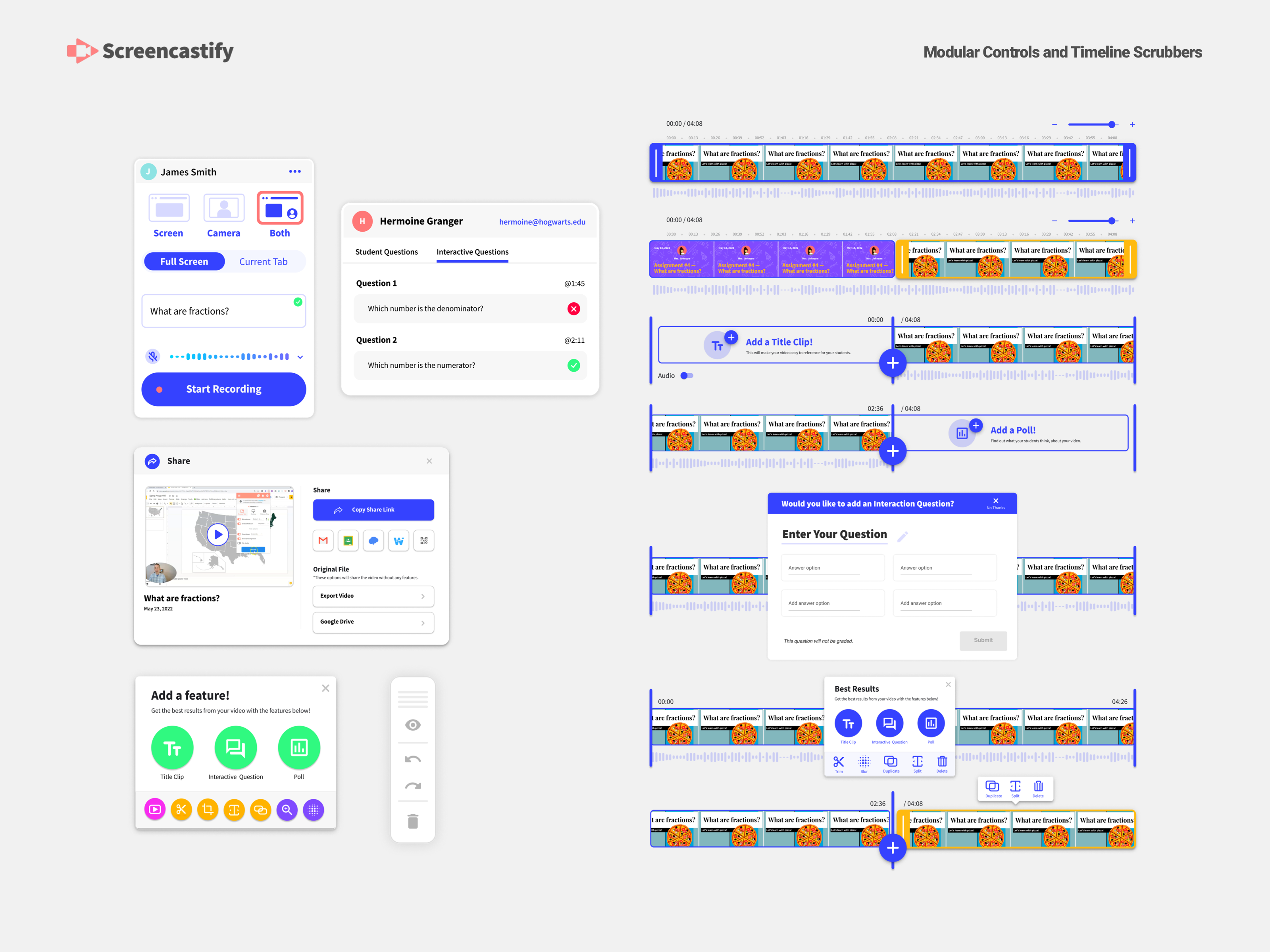
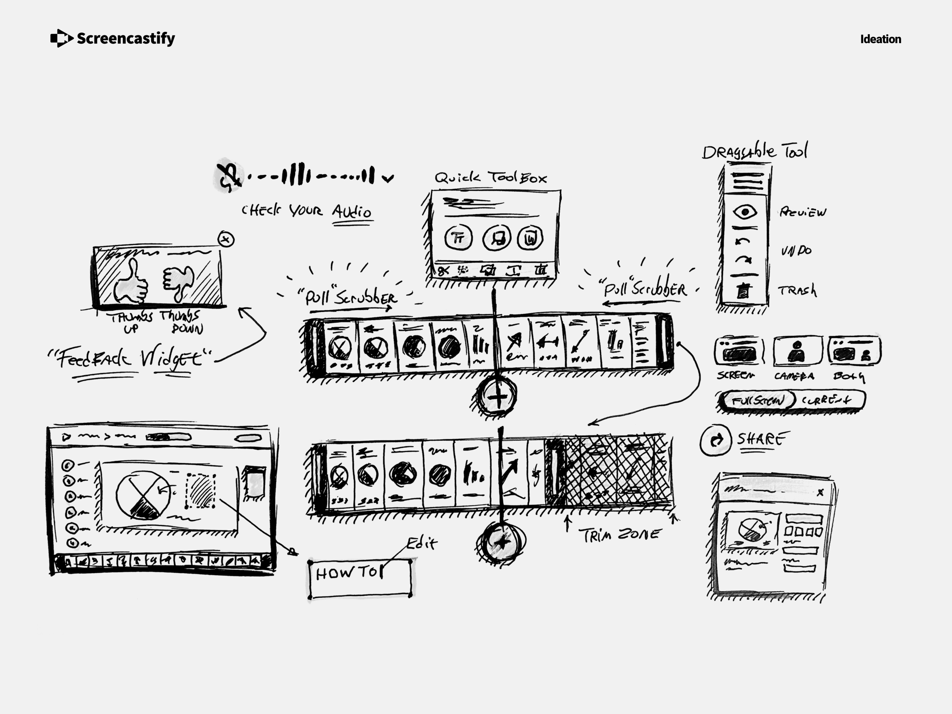
Simple means the tool matches what people already picture in their head. If someone expects to record, trim, highlight a moment, or add a quick emphasis for teaching, it should feel obvious how to do that.

The complexity lives underneath. Educational enhancements that are actually doing a lot of work should still feel natural and expected, not like advanced features. When those things just flow into the experience without breaking focus, that is when video creation feels simple instead of intimidating.
How do you decide what belongs in the product versus what should stay out?
I look at whether a feature helps someone finish the job they came in to do. If it does not clearly support recording, editing, or explaining something better, it probably does not belong.

I also pay attention to how often something would be used. If a feature adds weight for everyone but only helps a few edge cases, it stays out. Keeping the product focused is usually more valuable than making it do everything.
How do you design for teachers and students who may only use the tool occasionally?
I design as if every use might be someone’s first time back. The experience has to make sense without reminders or relearning.

That means clear starting points, familiar patterns, and very little setup. If someone can open the tool after weeks or months and immediately remember how to use it, the design is doing its job.
When a workflow feels confusing, how do you figure out whether it’s a design problem or a learning curve problem?
I test it early and watch people use it without guidance. If the same confusion shows up across tests or with different users, that is a design problem.

If someone stumbles once, figures it out, and moves on, that is just learning. Testing makes the difference obvious because patterns repeat and one-off issues fall away.