The Princeton Review

Creative Director

Overview

The Princeton Review is a college admission services company, offering test preparation services, tutoring/admissions resources, online courses, and books published by Random House. In 2015, The Princeton Review decided to expand their goals to include middle school students and become the trustworthy standard in online education with matching brand awareness. They expedited this process by acquiring Tutor.com.

I came onboard to facilitate the merger of the two companies and enhance the online services that current users came to expect and introduce The Princeton Review to the market as the 'one-stop-shop' for the user's complete educational journey.

As a company we successfully created a full service educational ecosystem to all users ranging from middle school to post graduate in the US and Canada and 14 other countries. My team worked directly on our new full service online educational classroom,  consumer website and mobile apps. The Princeton Review now successfully offers the best in homework help, tutoring, test prep, admissions and more.

Contributions

Strategy
Strategy
Design
Design
Brand
Brand
Responsive
Responsive
Analytics
Analytics
Quality
Quality Assurance

Process

Step 1: Simplify & Focus Brand

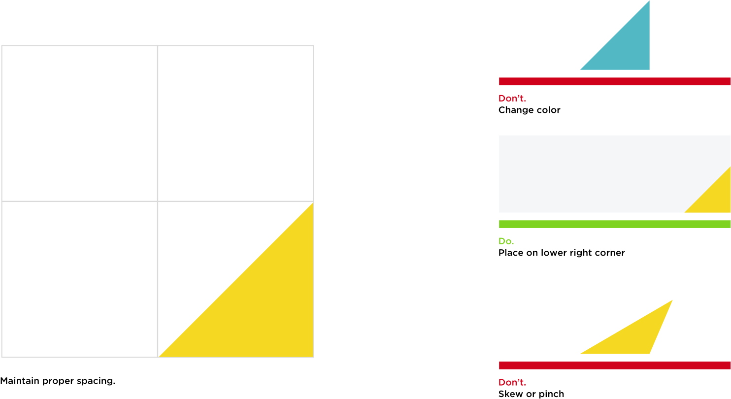
The first step was to take an audit of the base visuals; color palette, graphic library, photography, and typography.

Color Palette

Usage
Black

HEX: #000000
RGB: 0, 0, 0

Yellow

HEX: #F5DB21
RGB: 245, 219, 33

White

HEX: #FFFFFF
RGB: 255, 255, 255

Primary
Deep Blue

HEX: #0C4563
RGB: 12, 69, 99

Cyan

HEX: #52B8C4
RGB: 82, 184, 196

Magenta

HEX: #F30983
RGB: 243, 9, 131

Light Gray

HEX: #F2F2F2
RGB: 242, 242, 242

Medium Gray

HEX: #D8D8D8
RGB: 216, 216, 216

Secondary

Custom Icon Set

Having now acquired new users we needed a new look and feel that spoke to our whole user base, from students needing homework help assistance to students prepping for the MCAT®.

With our new color palette we created illustrations that were playful and inviting, but not childish.

A/B tests against the original control resulted in a landslide. 9 out of 10 users preferred the fresh design direction and completed tasks quicker by aid of the new icons.

Photography

To accompany our new icon library we set out to build our new photography library. Professional photo shoots with original content owned exclusively to a company is obviously the way to go, but we had no budget and needed images quick. Stock was the only option.

It became imperative to select imagery that expressed a distinctive voice and exemplified creative excellence. Images that represented genuine stories, avoiding the pitfalls of traditional stock. With a subtle reusable photo edit process we could provide a more cohesive look that could be carried out with minimal editing experience by all.

Photo Edit Process

Original

Color Balance

Gradient Overlay

Typography

Simplifying the type was the final component to our first step. Both sites initially had 3-4 faces with many sizes and weights.

We took it down to basics with one singular face, Gotham. Within that, sizes and weight options were kept minimal.

This approach to 'less is more', was key to merging the companies and getting all teams onboard immediately. It also provided a simple clean look to the sites and made cross-platform products look cohesive.

Type Specimen

GOTHAM

Type Layout

Process (cont.)

Step 2: Implement New Style

This is where the rubber meets the road and all the initial groundwork came together.

Header Heros

Our goal was to create templates that delivered the most important information above the fold. Given our broad spectrum of user types and vast product line, we designed varied hero templates to accommodate.

Template with numerical kvp's with a limited time promo (above the fold)
Template that accents kvp's using new icons within a collapsible panel (above the fold)
Template that reinforces the rate card with bulleted kvp's, within a collapsible panel (above the fold)

Rate Cards

The rate cards of The Princeton Review are gateways for our users. They become forks in the road that guide them down their educational path.

That means we took them VERY seriously and designed each one carefully with an enormous amount of A/B testing. We designed many versions catering to study styles, price points, matrix comparisons, kvp's, features, and promo codes.

The ever changing, ever testing rate card model was an essential part to growing the company. We found this reaped the greatest gains for conversions and user loyalty.

Study style rate card template with side-by-side price comparison
Pared down rate cards with kvp's
Rate cards with a promo feature
Horizontal rate card feature with lifestyle accent
Matrix comparison rate card

List Views

The Princeton Review offers A LOT of classes. It became essential to display these massive lists in the most digestible way for users. Displaying the key information in small chunks and options to see more details.

Boilerplates

Identity

Mobile

As supplements to our books and online courses we made native mobile apps for students to practice the basics of the SAT.